By Default, our responsive mobile code will cause any tables in your message to automatically stack starting with the first left cell and ending with the last right cell.
|
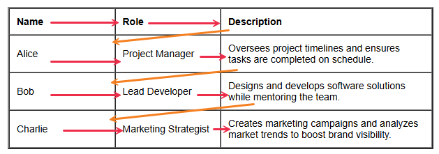
In this example table, you can see the red arrows indicate the stack order of the rows and the orange arrow indicates what would come next below the row's content.
|
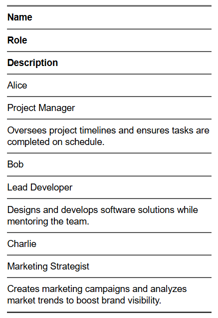
This is how the table would appear on mobile:
|
In some cases, like the example above, you may not want your columns to stack. Some table designs or content do not lend well to stacking and can make the information seem confusing. If this is the case for you, please follow the steps below to create a non-stacking table.
|
Begin by adding a Text (WYSIWYG) item to your message
Make your table by using the table tool or by using the HTML source code of to draft a basic table structure
- Avoid copying in a table from an external source. Copying from a rich text format document like a Word, PDF or other document type can bring in unwanted or unexpected code that impacts the display of your message.
|
|
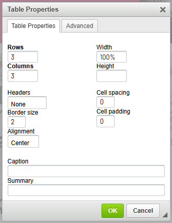
When creating your table, set your width to "100%" instead of the defaulted pixel value. This will be more mobile-friendly, but if you leave it to the set value, the no stacking code will still work as expected.
|
 |
|
Add your content to your table and use the table and cell properties tools to add padding, update border widths and styling or use the HTML source code to apply your edits manually.
- It helps to set a width with the !important property to each of your columns so the display is more consistent on mobile. In the example, I have used 25% width for the first 2 columns and 50% width for the last column to accommodate the text.
Once your content is completed, click to access the source code by clicking on the  button. button.
|
|
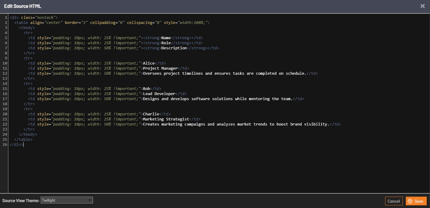
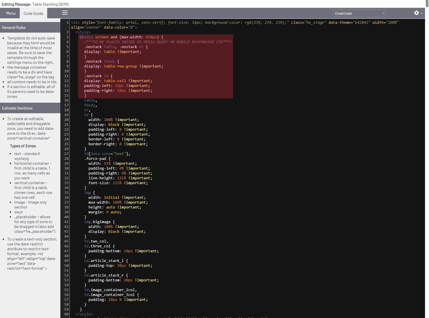
Add a
<div class="nostack">
code before the table and a
</div>
after the table
This will tell the message that this item should not stack on mobile after we place some special CSS in the "Email Code" view
Save this update by clicking the orange "save" button
|
 |
|
In the top right of your message click the "Email Designer" dropdown to switch to the email code view.
- If you do not have access to this view, please speak with your Administrator or reach out to support for assistance.
|
|
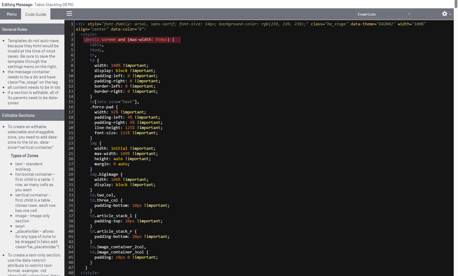
On the top of all of our Library templates, there is a standard set of responsive code that controls the mobile appearance of your message. In this area you will need to paste the snippet below after the code beginning with @media
|
 |
|
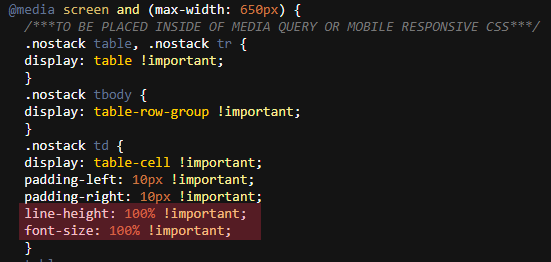
Press "Enter" or "Return" on your keyboard to begin a new line and paste the snippet below:
/***TO BE PLACED INSIDE OF MEDIA QUERY OR MOBILE RESPONSIVE CSS***/
.nostack table, .nostack tr {
display: table !important;
}
.nostack tbody {
display: table-row-group !important;
}
.nostack td {
display: table-cell !important;
padding-left: 10px !important;
padding-right: 10px !important;
}
|
 |
|
Scroll down to the bottom of this page and click "Save" to update your message code.
Send a test to see how your message and table appears!
|
Important notes:
|
If widths are not set for each column, the cells in each row will be based on how much content is in the cell and may not align.
Table Head code is not included in this CSS, it is best to avoid them and instead use standard cells and style your text as desired.
|
|
You may need to add code to change the font size or line height on mobile. This can be placed inside of the .nostack td CSS brackets like the example below:
|
 |
|
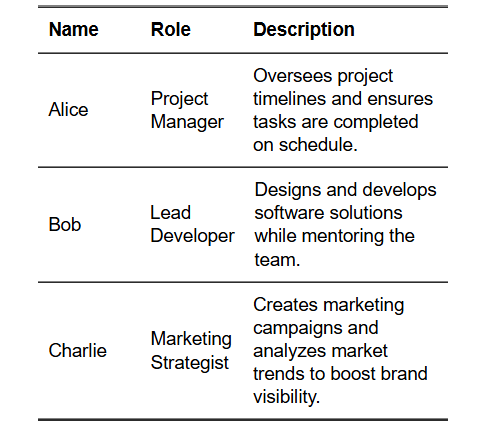
After applying, this table now appears as:
|
|